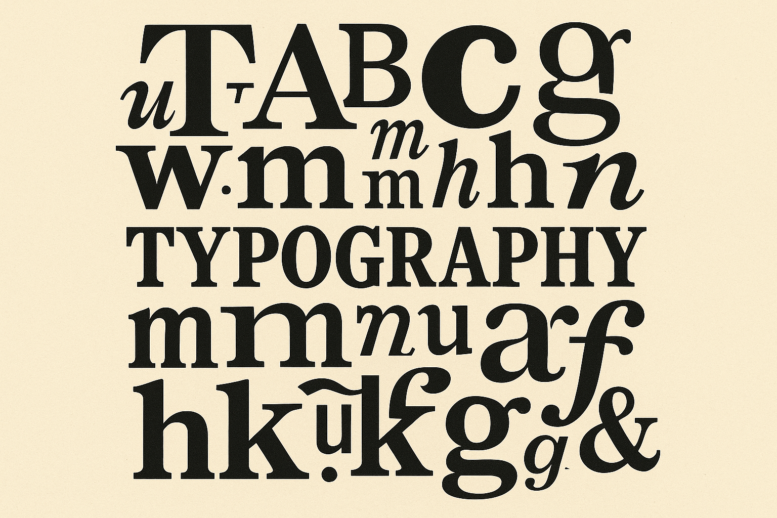
Why typography is UX, not just aesthetics
Good typography reduces cognitive load and creates clear paths to action. It influences:
- Clarity: Readers understand faster when type is legible and consistent.
- Hierarchy: Visual cues signal what matters and what to do next.
- Emotion and trust: Type choices communicate brand personality and credibility.
- Efficiency: Scannable layouts help users complete tasks with fewer mistakes.
When typography supports comprehension and confidence, conversion rates benefit—whether the goal is a form submission, a checkout, or a product demo request.
Readability fundamentals that reduce friction
Small typographic tweaks often yield outsized UX gains.
- Base size: Aim for a comfortable default (often 16–18 px on mobile, 18–20 px on desktop body text).
- Line height: Provide breathing room, typically 1.4–1.6× for body copy.
- Line length: Keep paragraphs around 45–75 characters; narrower for mobile.
- Contrast: Ensure text/background contrast is strong in all themes and states.
- Spacing: Use adequate paragraph spacing and consistent margins to avoid “text walls.”
- Alignment: Left-align long‑form Latin text; justify cautiously to avoid rivers.
- Case and formatting: Avoid ALL CAPS for long passages; use italics sparingly for readability.
These fundamentals minimize effort for readers, lowering abandonment on content-heavy pages and forms.
Hierarchy guides attention and task completion
Hierarchy helps users find answers and decide quickly.
- Scales: Use a clear type scale (e.g., 1.125× or 1.2× progression) for headings and subheads.
- Weight and color: Contrast weight and tone to group related content and emphasize CTAs.
- Structure: Break content with meaningful subheads, bullets, and pull quotes.
- Proximity and whitespace: Group related elements and separate actions from noise.
A well-structured page moves visitors from headline to proof to action without guesswork.
Accessibility and inclusivity are non‑negotiable
Accessible type is good UX for everyone and increasingly a legal requirement.
- Contrast ratios: Target at least 4.5:1 for normal text and 3:1 for large text per WCAG.
- Real text, not images: Keeps content selectable, searchable, and screen‑reader friendly.
- Link clarity: Use distinct styles beyond color alone; avoid “click here.”
- Focus and states: Ensure clear focus styles and visible states for interactive text.
- Motion and readability: Avoid aggressive text animations and respect reduced‑motion preferences.
- Language and tone: Use plain, unambiguous language to reduce cognitive load.
Quick win: Audit contrast with the WebAIM tool and fix the top offenders site‑wide. Use your design system to enforce contrast and focus tokens by default.
Performance and font loading affect perceived quality
Beautiful type that loads slowly still hurts conversions.
- File formats: Serve WOFF2; subset character sets to what you actually use.
- Variable fonts: Replace multiple weights/styles with one file to cut requests and improve consistency.
- Loading strategy: Use font‑display strategies to avoid invisible text; preload critical fonts prudently.
- Fallback stacks: Choose fallbacks with similar metrics to reduce layout shift.
- Budgets and monitoring: Set a font budget (e.g., under 200–300 KB compressed across critical fonts) and watch for regressions.
Fewer delays and less layout shift lead to smoother first impressions and better engagement.
Brand voice and trust through type
Type is a key part of brand perception.
- Personality: Serif or humanist sans can signal warmth and credibility; geometric sans suggests modernity and precision.
- Consistency: Use a limited, purposeful set of styles to avoid visual noise.
- Context: Match type to category expectations without falling into cliché; let content and audience lead.
When typography aligns with message and audience, trust rises—and hesitation drops.
Mobile‑first and responsive typography
Reading happens on small screens first.
- Fluid scaling: Use a consistent scale across breakpoints so headings don’t dwarf body text on mobile.
- Touch targets: Ensure button labels are large and clear with ample padding.
- Content density: Tighten line length and increase line height on narrow viewports.
- Dark mode: Validate contrast and color roles in both light and dark themes.
Aim for parity of comprehension: users should understand as quickly on a phone as on a desktop.
Microcopy, forms, and help text
Conversions often hinge on tiny bits of text.
- Labels and hints: Place labels above inputs; keep helper text concise and legible.
- Error messages: Use clear language and high contrast; show how to fix the problem.
- Price and policy text: Make critical details readable without zooming or pinching.
Clarity and confidence at the moment of decision are crucial.
How to test typography for conversion impact
Treat typography like any other high‑leverage design variable.
- Isolate variables: Test one factor at a time (e.g., base size or button label weight).
- Choose meaningful metrics: Completion rate, time to first action, scroll depth, and INP/CLS.
- Segment thoughtfully: Mobile vs. desktop, new vs. returning, low‑vision assistive tech users.
- Run long enough: Ensure adequate sample size and stable traffic before drawing conclusions.
- Pair quant with qual: Heatmaps and usability tests reveal where type causes friction.
Quick reference: typographic levers to test
| Lever | UX impact | Conversion risk if ignored | Easy test this month |
|---|---|---|---|
| Base font size | Reduces cognitive load | Fatigue, higher bounce on content pages | Increase body size by 1–2 px and track scroll and time on page |
| Line length | Improves comprehension | Skimming, missed key points | Narrow content width on desktop and watch completion of key sections |
| Contrast ratio | Ensures legibility | Errors in forms; lower trust | Fix low‑contrast text on CTA and form labels; measure completion |
| Headline hierarchy | Guides scanning | Missed value prop | Introduce subheads and consistent H2/H3 scale; check click‑through |
| CTA label size/weight | Clarifies action | Hesitation, lower CTR | Increase label size/weight; test with variant copy |
| Font loading strategy | Stabilizes layout | Layout shift, perceived slowness | Implement swap/preload and measure CLS and bounce |
| Variable font adoption | Simplifies styles | Inconsistent UI, heavier bundles | Replace multiple weights with one variable font; monitor LCP |
A 30‑day action plan
- Week 1: Audit
- Inventory fonts, weights, and sizes in use; identify redundancies.
- Measure contrast and font performance; record CLS, LCP, and INP.
- Gather baseline conversion metrics for key journeys.
- Week 2: Fix fundamentals
- Set a responsive type scale and standardize line height and spacing.
- Address low‑contrast text and improve link and focus styles.
- Implement font‑display and preload only truly critical fonts.
- Week 3: Align brand and hierarchy
- Define brand typography tokens (sizes, weights, letter‑spacing, colors).
- Create content patterns for headlines, body, captions, and CTAs.
- Update templates for product, blog, and landing pages.
- Week 4: Test and learn
- Run one A/B test (e.g., base body size or CTA label weight).
- Pair with 5–7 usability sessions focused on readability and task completion.
- Document outcomes; add typography checks to your design system CI.
Tools to help you move faster
- Contrast and accessibility: WebAIM Contrast Checker, Deque Color Contrast
- Performance and stability: Lighthouse, WebPageTest
- Type selection and pairing: Google Fonts, Fontsource
The bottom line
Typography is one of the highest‑leverage tools in digital product design. When your type improves comprehension, signals hierarchy, and loads quickly, users progress with confidence—and conversions follow. Start with readability, enforce accessibility, optimize performance, and test deliberately. The result is a site that feels effortless to use and easy to trust.
If you’d like a typography and conversion audit—or help implementing a scalable type system—get in touch to schedule a discovery session.


0 Comments